Card Styles
Cards can house content to promote your Locations, Menus, News, Press, Events & Private Event Venues. They can consist of an image, a heading, and sometimes include a brief description. For a more comprehensive look please refer to our card content guide. Cards are clickable and function in three distinct ways. Once interacted with they can lead you to an internal page, link out to a third party site, or prompt a popup. There are many ways to customize cards to fit your brand with some ideas featured below!
Layout
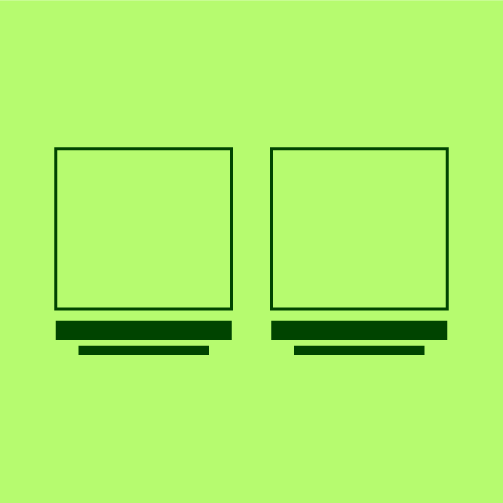
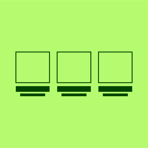
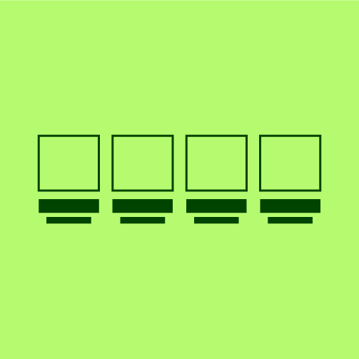
Card layouts can be arranged in two, three, or four columns depending on desired content organization. Our cards are responsive, so as the screen size scales down, the cards will begin to stack.
Orientation
Card images are flexible and can be displayed in different orientations like landscape, square, or portrait depending on specific content needs.
Shape
Cards don't have to be one shape — for example, they can be square, arched, circular or even asymmetrical. These different options can help a card feel more appropriately branded to each website.
Content
Depending on the customers goals, the amount of content being displayed on cards can vary. The only element that is a must have, is all cards need a card heading for accessibility.
Asset Application
Assets like textures, borders and illustrations can be applied to cards to make them feel more customized and visually engaging. This can also help reinforce a brand's identity.
Hover State
Hover states give the user a visual cue that a card is interactive through small animations or style changes. They help guide users to click into and explore additional information tied to that card.